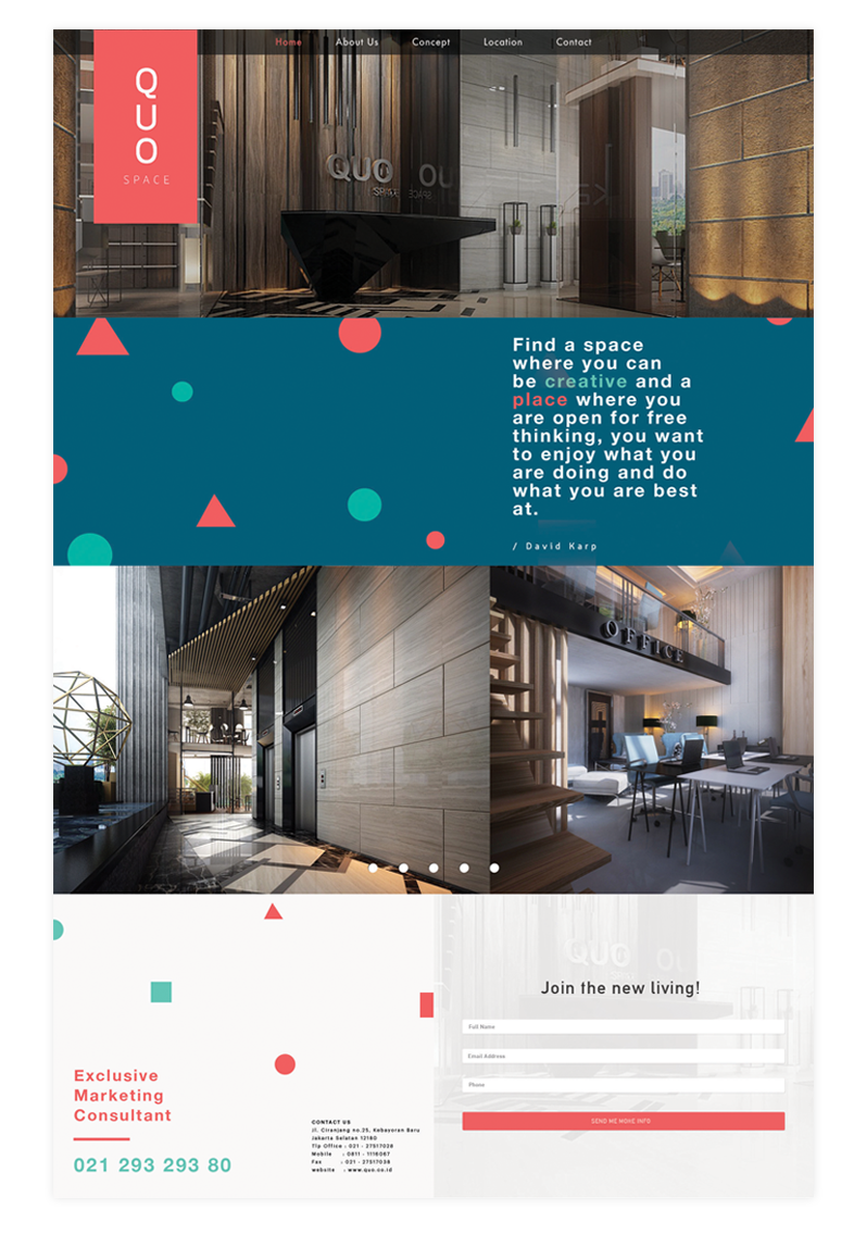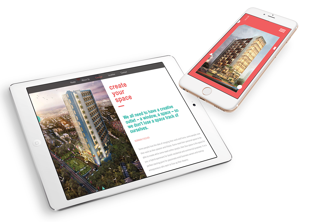


Mobile Responsive
The design employs a proportional, mobile first approach, wherein linked typographic and grid systems are scaled via percentage font-sizes. This method makes it a breeze to control layouts across all screen sizes, devices, and resolutions with a single declaration.